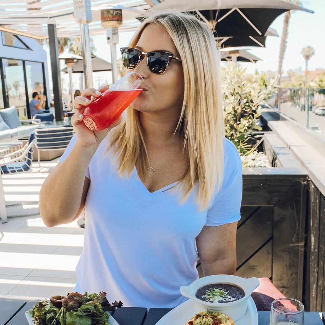
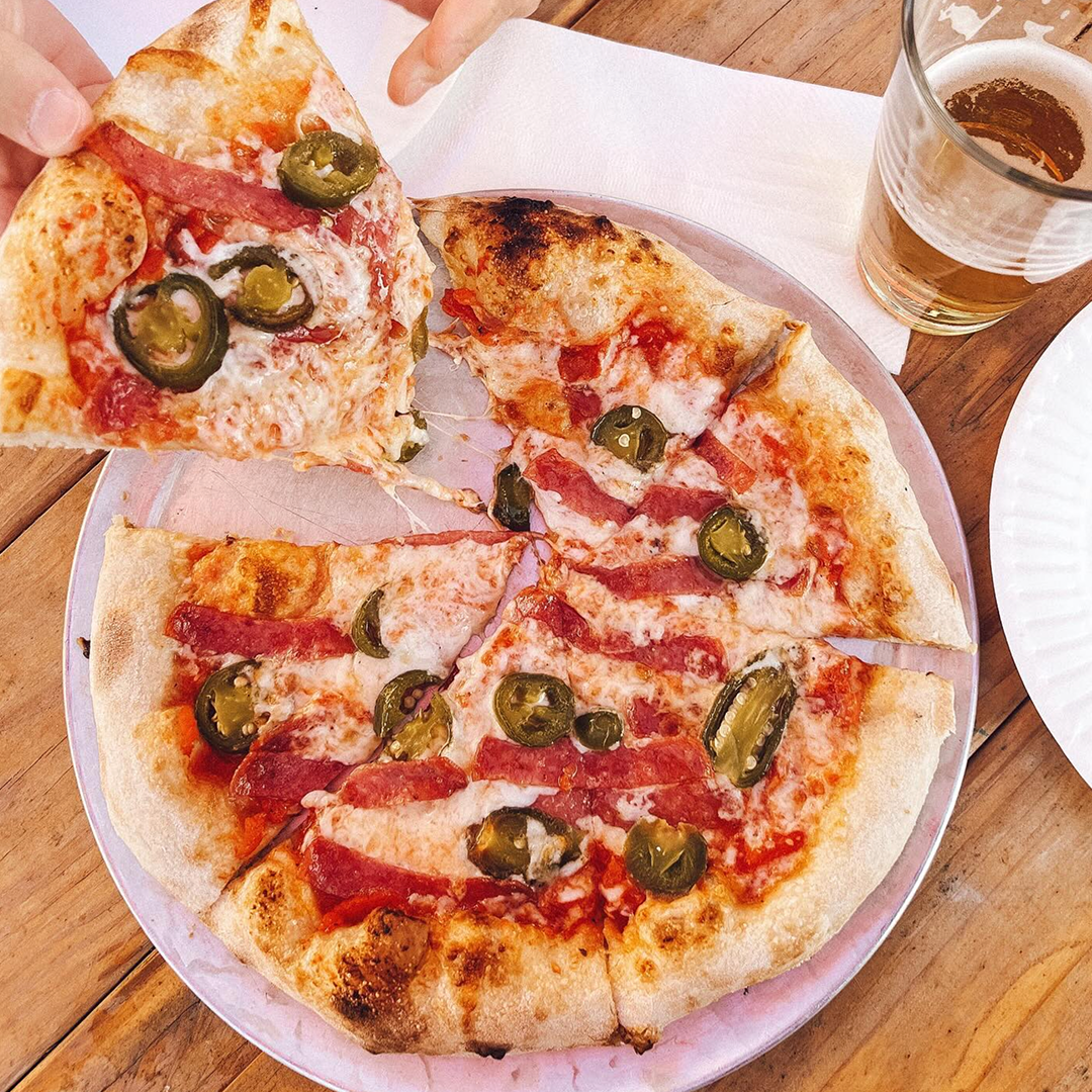
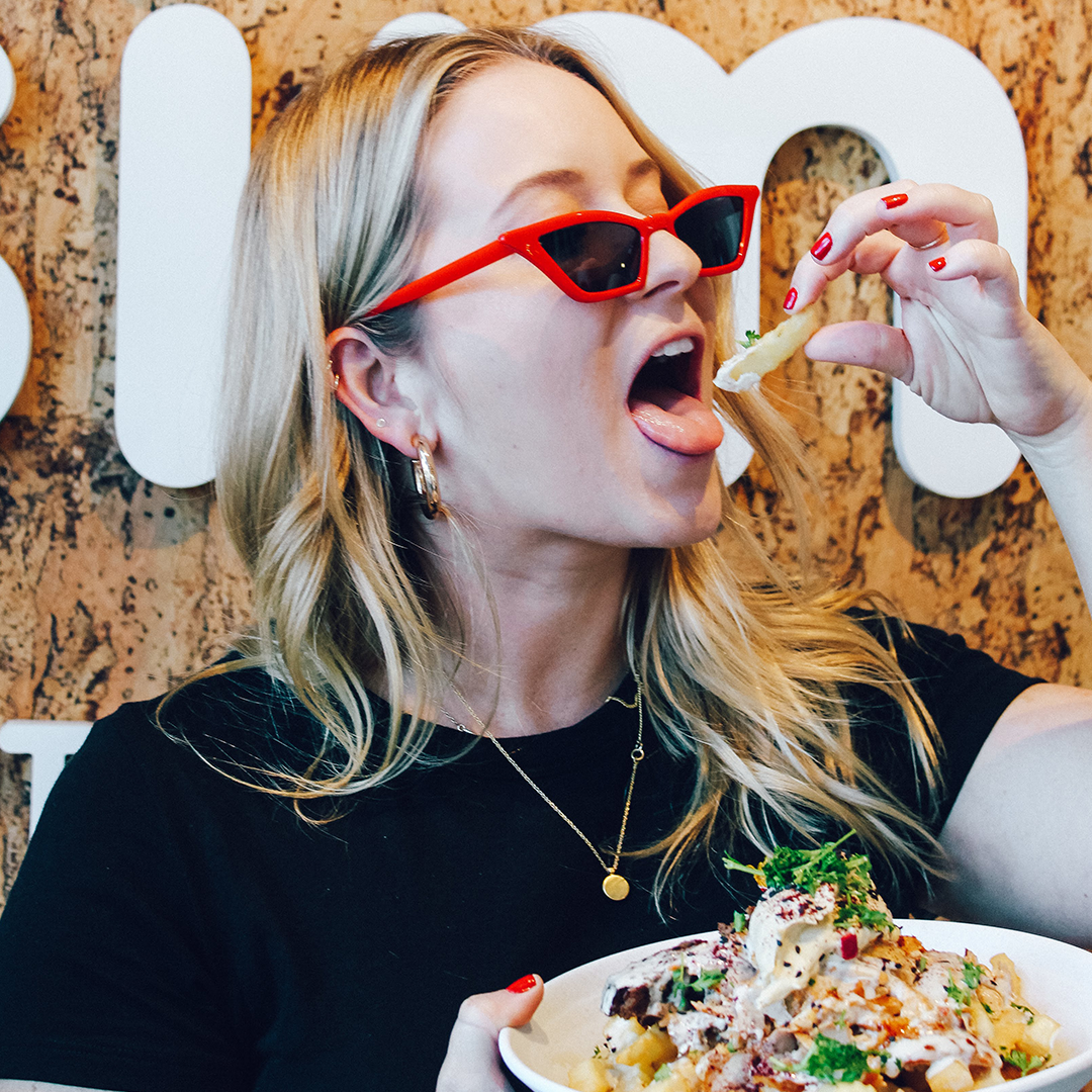
Talk about the ultimate female foodie. Kelsey is the KWEEN when it comes to San Diego’s food scene. Every once and a while I get to tag along and to say it’s a fun time is the most underrated statement of the year. Blonde+Butter is a raw look at real life. It’s embarrassing dating stories, diet struggles, working as a twenty-something, celebrity gossip, pop culture garbage, life inspiration, drunken messes and a shit ton of laughs. Blonde+Butter is now more focused on building up food brands via social media. with many partners in North County San Diego, it’s been so fun to watch Kelsey’s journey on finding the hottest spots near where she lives in Oceanside.
Therefore, her branding needed to reflect that. Something fun, edgy, and recognizable. Food blogs are a dime a dozen lately and I refused to let hers get buried. Below are branding images for Kelsey’s site that allow her to be the go-to food blogger. Using fun graphics that can be used in all aspects of social are important for having her brand stand out in the way it deserves to.


Kelsey’s logo was designed to be one-of-a-kind. ‘Blonde’ is hand written and digitized. ‘Butter’ is a simple sans serif font to reinforce that Blonde+Butter is an account for the basic B in all of us.

Blonde+Butter demands something spunky and trendy, as evidence by Kelsey’s lively Instagram presence. Fun patterns based off simple shapes help keep her brand consistent and timeless.


